Clothia iPad App 2.0
Clothia already had a website and an iPad app, but they wanted to revamp the app to be more social and to help them improve their new user acquisition. So we redesigned it from top to bottom, with the focus on making the interactions more low-cost, and sharing to third party networks more seamless. As a result, “loving”, sharing, and commenting has increased, and the app has surpassed the website in new user signups and activity.
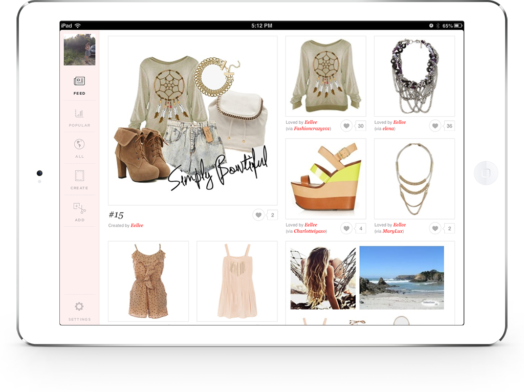
Immediate browsing experience
We began with high-level concept sketches to help us figure out the best way for the user to navigate through the content on the app, settling on a landscape layout with an infinite scrolling feed that displays a mix of individual items and user-created looks, where the images could be displayed as large as possible. Based on our observations of how users interacted with the website, it was clear that we needed users to be immediately immersed in an easily browsable interface of compelling images, with only the most immediately useful information (user attribution) and low-cost interaction (the “heart” button) included in this initial information layer.
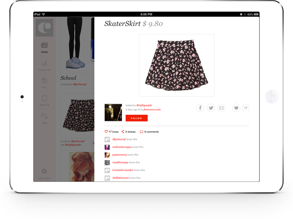
Details view
Just one tap away, the user can see the look or item in it’s full glory view, along with more attribution and following info, third party sharing buttons, and a feed of all of the user activity below it. If it’s a look, the user can even add the individual items that it contains to their own closet with just a tap of the heart.
Quick and easy onboarding
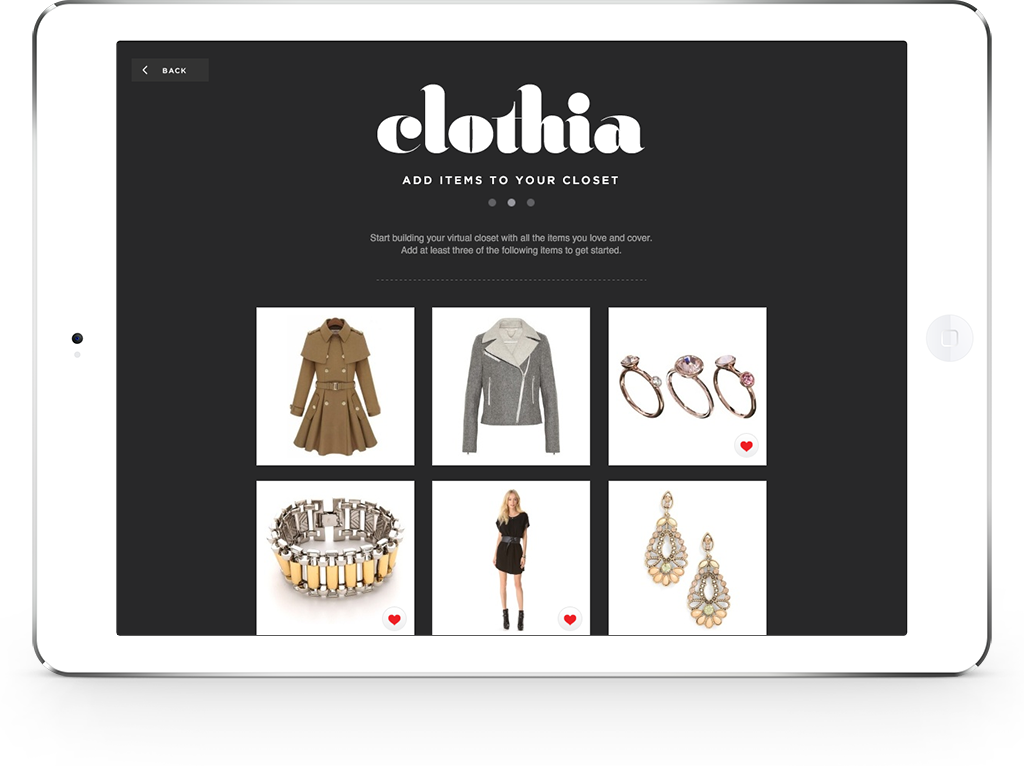
The onboarding process needed to be quick and painless, while still ensuring that new users are set up for a successful first use of the app. We settled on a 3-step registration process that lets the user quickly pick three items to add to their closet, and automatically follow other users on Clothia based on the items that they picked. Alternatively, users can decide to skip the onboarding process to get into the app and look around, and can register at any time.
Bigger, cleaner workspace
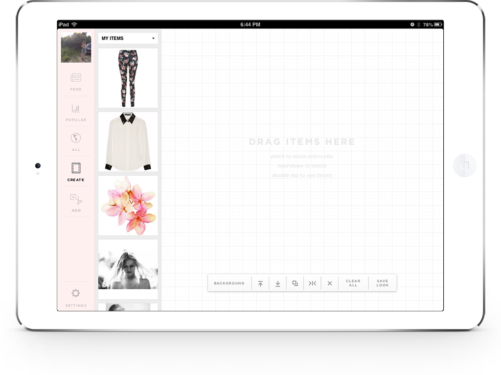
The technology behind the “create” section of the app (where users place, move, and scale items to create their own collage-like “looks”) already worked great and didn’t need a lot of reworking. What it did need however, was a larger work area for the user to play around in, a more consolidated tool bar, and better loading of the lists of items the user could pull from, including everything available by category, all of the items from the user’s own closet, and a search bar for finding items with specific tags like “floral” or “blue”.
One-step sharing
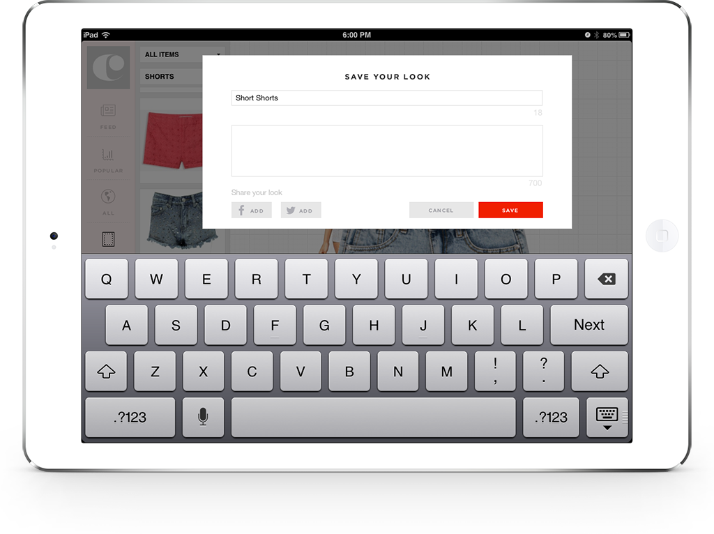
Wanting to make the sharing process as seamlessly integrated as possible, we designed a one-step saving and sharing process that allows the user to connect their third party accounts (if they haven’t already) or turn sharing “off” for a third party network (sharing is “on” by default until the user changes it in their settings).
Simplified terminology and interactions
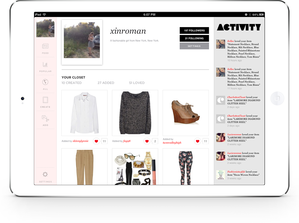
Agreeing that the highest cost interactions in the app were the process of adding an item (48% of users were doing this) and creating a look (56% of users were doing this), we decided that your closet shouldn’t just include the items that you’ve added and looks that youve created, but all of the items and looks that you’ve loved too. Now users no longer have to understand the insider terminology of adding vs hearting to know where to find things again, and the profile page has become a feed for all of your favorite things on Clothia, not just a specialized page for power users.
