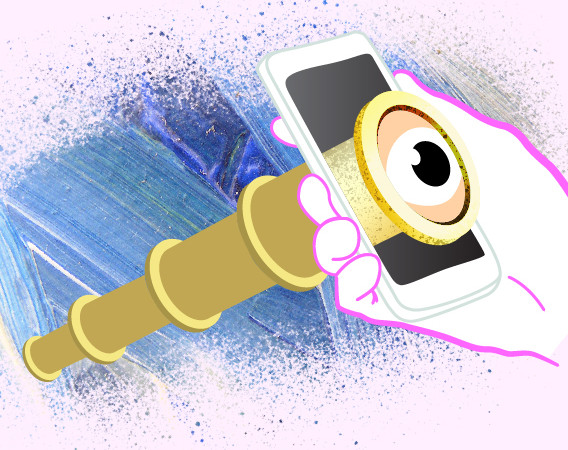
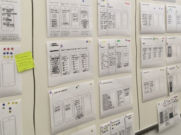
Last year, my boyfriend Josh and I decided that we needed to make some changes to our diets. We’re generally very good eaters – anyone who knows me knows that I love to cook and I do it often – but it was the middle of winter, energy and morale were getting low, food was generally of the comfort variety, and we realized that we could make some incremental changes that would help us start getting in the right mindset for spring. For me, that meant cutting the wheat and gluten out of my diet, eating more nutritious, less filling meals, while Josh was beginning to realize that his soda and sweets intake seriously needed to be curbed (or maybe he was just getting sick of me nagging him).
But a few weeks just left to nothing but our word didn’t really mean that we were sticking to our diets. It was too easy to slip here and there, and then look back on the previous week thinking that we had done better than we actually had. I decided that we needed to hold ourselves, and each other, more accountable, and that the only way to do that was to keep a record of our offenses.
So I put together this chart and put it up on the refrigerator. For every offense – that is, each time we ate something we weren’t supposed to – we had to write it down on the chart. At the end of the week we tallied up the offenses and whoever had the most offenses “lost”. We got pretty competitive, even realizing after a couple of weeks that whenever one of us exercised and the other one didn’t that we were actually holding that over each other’s heads. So naturally, the next step (although it didn’t make its way into the design of the chart) was to mark an “amnesty point” each time that we exercised and deduct those from our weekly totals, which essentially allowed us to make up for a food slip-up by working out a bit, or to pull out ahead of the other person at the last minute and break a tie.
A lot has changed in the past couple years for me in the world of food and how I approach it. While my big picture food philosophy is probably best saved for another post, suffice it to say that these days I’m thinking more about what I should eat than what I shouldn’t. (I am a huge stickler for 3-5 fruits and veggies a day, for example, at least one of those veggies being a leafy green.) So what really spurred me to start to re-think this chart and this exercise again (aside from winter coming to a close) is the “Live and Let Diet” episode of Good Eats I caught while I was on a plane to Austin this week. While this chart served me well last year and definitely set me down a better path to making myself accountable for the “bad” foods that I ate, I’m wondering how a system that rewards eating healthy stuff could differ from one that punishes unhealthy stuff, and how the idea of Alton Brown’s “Four Lists” could be used in a similarly competitive diary setting to promote accountability and enable change. I hate to call it a “diet” exactly, but more of a way to keep track of all of the good things you eat without relying on your memory, which to me is the most difficult way to try to make changes in something you do every day. I’ll be thinking about this a lot more as we head into Spring and a new season of eating! In the meantime, you can download the original Food Chart here and let me know if it helps you make any changes.
Update: I’ve finally got the food chart up after some web host wrangling. Download it here.
This entry was written by xinroman, posted on March 19, 2010 | (1) comment
Tags: competition, data, diet, Food, games, tracking
With SXSW right around the corner I think it’s time to dust off ye olde blog. We’ve been through some rough times around here the past couple of years, from losing my original domain at xinroman.com to almost losing the second one (turns out that the customer service people at GoDaddy are actually extremely helpful – who knew?). But I figure it’s not too late to resurrect some old posts and finally get around to writing some new ones.
For those of you who don’t know me or know why you’re here, my name is Christin Roman and I am a User Experience Designer in NYC. I started this blog 5 years ago as a place to document my research, thoughts, and projects, and to experiment with some web programming and blogging tools while I was a graduate student at ITP. In 2007, I graduated and have had a variety of gigs doing information architecture, interaction design, experience design, user testing, project management, planning, and strategy consulting for start-ups, non-profits, and other types of companies. For the past year I’ve been working at Blenderbox, a home-grown 20-person interactive agency started by husband-and-wife team Jason Jeffries and Sarah McLoughlin. I’ve designed ecommerce sites, interactive sites, media sharing sites, museum sites, educational sites…you name it. My passion is doing design research, and creating that fully-formed picture of the people who I’m designing for.
This blog was named for a quote I once heard Red Burns – the founder and still chair (over 25 years later) of ITP, and an incredible woman – say to my class when we were first-year students. (I should mention that she is in fact known for her bluntness and sometimes surprising off-the-cuff remarks.) She said “I hate robots”. With a 100 confused students looking back at her she continued. “I hate artificial intelligence. I don’t believe in artificial intelligence, I believe in artificial augmentation.” What she hates is the idea that technology should be used to replace people. So instead, she inspires her students to develop technology that will help people.
This entry was written by xinroman, posted on March 11, 2010 | (0) comments
Tags: About Me, ia, information architecture, user experience, ux, web design
You know how every once in a while you hear one of those statistics about how lazy and tv-obsessed Americans are and you think “how is that even possible?” Like the one that said 40% of Americans will sit and watch a television show they don’t like just because they don’t want to change the channel? Well I guess the disclaimer here should be that I think I might be one of those people. I’m not a tv-holic necessarily (I haven’t had cable since I was in college, and have lived long stretches of time with nothing but a laptop for entertainment without complaint), but when I do turn on the tv, it amazes me the shit that I will get sucked into watching. The truth of this can be seen in the hours of American Idol I’ve logged over the last couple of years, the fact that I now know what a biathlon is despite having grown up in Florida in complete ignorance of winter sports, or the that just last night I sat through the entire first half of the Marriage Ref (to see just how bad it really was, I told myself).
But Undercover Boss actually peaked my interest as soon as they started airing commercials for its series premier, and I went out of my way to make sure that I watched the first episode. Why? Because the show is essentially an exercise in user-centered design.
What these bosses are experiencing is the first step to user-centered design – empathy.
First, the show creates empathy. That’s the “break-through” that these bosses are experiencing, and it’s one of the first steps to a user-centered design methodology. It doesn’t necessarily have to be wrapped up in the emotional life story of a young woman struggling to provide for her family while doing the work of two job descriptions (that’s more for effect), but it does have to be tangible. Explaining how a person thinks or operates is one thing – and it will get you pretty far in creating empathy – but seeing people operate in real life, the way that ethnographers do, the observers have to be inhuman not to walk away feeling like they truly understand where that person is coming from.
Second, the employees in the show are stakeholders. Interviewing stakeholders is a great place to start when undertaking a UX project, in my case, one that’s meant to redesign a system that’s expected to achieve certain goals towards the mission or bottom line of a company. Most clients agree. But where I often find that C-level executives get confused is in the definition of who the stakeholders really are. (Maybe the word is just to similar to stockholder?) What they often get wrong is that a stakeholder isn’t just a person who is high-up in or understands the marketing-speak of the company – they are not the most influential or “important” people there – they can be anyone who’s life or job is affected by the system being designed, even if it is in the most mundane way like fielding customer service complaints or doing data-entry. The lowest-level employees are stakeholders, and often the most important ones.
Third, the problems the boss is observing are design problems. The mandates that come down the company latter don’t have to be at odds with the humanity of the work environment that they sometimes unintentionally create. In observing the problems the show put forth it’s obvious that many of them, whether through incremental change or a massive overhaul, can be solved now that they’ve been identified. What I hope that CEOs understand is that those solutions don’t have to hurt productivity, and can in fact have a very positive effect once your employees’ natural capabilities and limitations are taken into account. It’s a fact, women working typically male-dominated jobs are going to have some more extensive toiletry needs that need to be taken into account, and I’m sure that someone out there is already doing the work to make sure that they are. (Or, maybe not.)
This show is incredibly relevant, but not just to people who are interested in user-centered design. As a society we are constantly trying to reconcile our capitalist beliefs with our humanist natures, and the US often gets the worst rap when it comes to “willful” ignorance of exploitative practices. Whether through design or through blunder, seeing CEOs meet their day of reckoning in the public eye, and the extent to which they are held accountable for their company practices is becoming an integral part of the puzzle that is consumer behavior. It’s much more enjoyable to be a part of these epiphanies as they unfold than to just cringe at the aftermath. If ignorance is part of the problem, then let’s at least give these guys a chance to smarten up, then see whether that day of reckoning still comes.
Somebody very smart out there is watching every episode of this show, and calling each CEO and their marketing teams to offer their UX design services.
This entry was written by xinroman, posted on March 9, 2010 | (0) comments
Tags: discovery, empathy, television, user experience, user-centered design, ux

Automatic flushing toilets were either not designed with women in mind, or not tested extensively on women before they were deployed in millions of bathrooms across America.
Without getting into graphic detail, let’s just say that sometimes there are “other things” that women are trying to do when they are on the toilet besides simply relieving themselves, flushing, and going. Sometimes these “things” take a little bit of time and a little bit of agility. How that movement doesn’t get translated into a “she’s finished now, it’s time to flush” signal to the toilet is too technical for me, but that’s exactly what happens (sometimes multiple times in one “sitting”). The best result is a lot of wasted water, the worst is a toilet that splashes a little too high while it’s flushing and the toilet ceases to be a toilet but something more akin to a bedet.
Now if you’d asked me my opinion on the subject a few weeks ago, I would’ve stopped there. Until then I’d thought the automatic flowing faucet to be a relatively harmless invention, until, after getting off an 8:00AM flight on my way to DC to see a client, I dared to try to put on my makeup in front of a mirror that was hanging over one of these sinks. I guess just standing there (and leaning forward to get as close to the mirror as possible) was enough to keep turning the damn thing on and off, on and off…I tried to find a lone mirror (one that didn’t have a sink under it) but there wasn’t one. So instead I just had to stand there like a water-wasting asshole while I tried to rush through my makeup application as quickly as possible.
The summary here should be pretty obvious – we are not robots. (I can image that men have complaints about these mechanisms too.) Assuming that the interaction with an appliance like this will be a simple three-step process that’s the same every time seriously over simplifies its utility and ignores the larger space in which it exists. It’s as though the appliances were designed in a vaccuum, with no consideration as to how that space is used in a multitude of ways.
This entry was written by xinroman, posted on | (2) comments
Tags: automation, robots, user experience, ux
This screengrab really speaks for itself:

This entry was written by xinroman, posted on March 4, 2010 | (0) comments
Tags: form design, ia, information architecture, user experience, ux, web design

When it comes to technology, I often find myself trying to live in two camps at once. On the one hand I am interested in new technology and new interfaces, and I want to be one of the first to try something and make some conjecture about how that new thing is or isn’t going to affect peoples’ lives or the technological landscape or what have you. On the other hand, it’s my job to try to empathize with people and imagine the contexts in which they experience the applications I have a hand in designing, and let’s face it, the majority of people out there are still running IE6.
Now I’m not saying I’m going to remain willfully ignorant, but I do try to make sure I’ve at least got my sites broad enough to include slightly outdated hardware and software (a slow-running computer and too-small monitor may be annoying when I’m trying to work from home, but man do I see our sites differently there than I do on my huge, bright iMac at work). The truth is that some people will just refuse to upgrade unless you force them too. And as an aside I think that’s one area where Mac really excels – despite the complaints (and there is often reason to complain), when Apple wants to phase out a technology, they will simply cut it off, with little apology, rather than trying to accommodate everyone. It’s tough love, but it’s really effective in pushing new standards (although I think they’ll prove to have less sway than they’d like to admit in standardizing HTML 5). Microsoft, conversely, I believe is directly to blame for the number of people still running outdated web browsers, and their history of making caveats and disclaimers for what can/can’t run on new OS versions can give people feature-list fatigue when trying to decide whether to upgrade. Apple on the other hand, just reassures you that everything will work fine and practically forces you to upgrade.
So it’s a difficult line to tow. Fortunately I’ve got a new gadget junky of a boyfriend who’s always ready to make the switch or get the new thing, so I have the advantage of having access to that while enjoying the luxury of being a little bit slower to move on my own machinery than I would otherwise be. Maybe not a luddite, exactly, but a skeptic.
This entry was written by xinroman, posted on January 11, 2010 | (0) comments
Tags: user experience, ux